Get Started

- Sign in to Lean Obsidian Studio (LOS - Getting Started)
- Click the
CSS Snippetsmodule selector
How to Use
Starter Cards
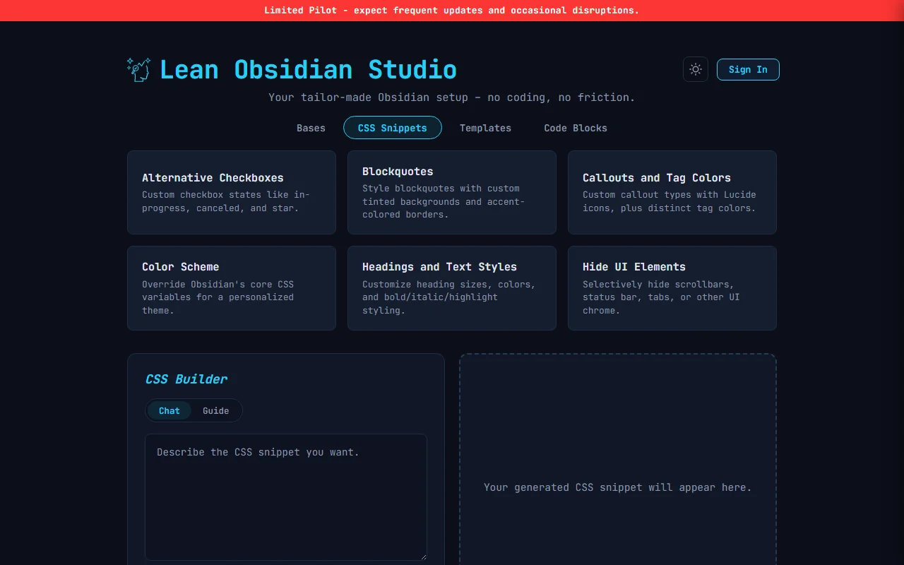
Six pre-built CSS snippets that generate instantly (no AI call, no credits used).
Click any starter card and Generate to generate the output immediately.
After the first generation, edit your prompt and click Update to refine the output without starting over.
| Starter | What It Creates |
|---|---|
| Alternative Checkboxes | Custom checkbox states like in-progress, canceled, star, question, forwarded |
| Blockquotes and Code Blocks | Styled blockquotes and code block formatting |
| Callouts and Tag Colors | Custom callout styles and colored tag pills |
| Color Scheme | Full vault color theme with custom variables |
| Headings and Text Styles | Custom heading sizes, colors, and text formatting |
| Hide UI Elements | Selectively hide status bar, vault name, or other UI parts |
Chat
Type a plain-text description of the styling you want. Example prompts:
- “Make my callouts have rounded corners and a gradient background”
- “Hide the status bar and vault name in dark mode”
- “Style tags with colored pills based on tag name”
- “Make headings use a different font and add a bottom border”
After the first generation, edit your prompt and click Update to refine the output without starting over.
Guide (Wizard)
A four-step flow that builds your snippet interactively. Click the Guide toggle next to Chat to switch to wizard mode. Each step has a progress bar at the top.
The wizard generates the final .css file at the end. You can download the .css file or copy the output.
Step 1 - Target
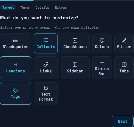
Choose what you want to customize. You can pick multiple targets at once - click to select, click again to deselect.
Available targets:
- Blockquotes - style blockquote backgrounds and borders
- Callouts - define custom callout types with colors, icons, and gradients
- Checkboxes - add alternative task states (in-progress, canceled, question, etc.)
- Colors - set vault-wide background, text, and accent colors
- Editor - customize the editing area
- Headings - set per-level colors for H1 through H6
- Links - style internal and external links
- Sidebar - customize or hide sidebar elements
- Status Bar - show or hide the bottom status bar
- Tabs - style the tab header bar
- Tags - color individual tags with background and text colors
- Text Format - set colors for bold, italic, strikethrough, and highlighted text
Step 2 - Theme
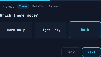
Choose which theme mode the CSS applies to.
- Dark Only - CSS only takes effect in dark mode
- Light Only - CSS only takes effect in light mode
- Both - CSS applies to both themes
Step 3 - Details
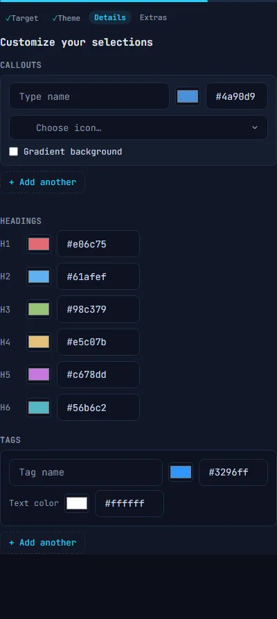
Configure specific settings for each target you selected in Step 1. The options shown here depend on your targets.
Callouts - for each callout type, set:
- A name (e.g. “warning”, “success”, “idea”)
- A color with color picker or hex input
- An icon using the searchable Lucide icon picker
- Optional gradient background (radial or linear)
- Click
+ Add anotherfor more callout types
Checkboxes - define custom task states using single characters
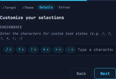
Each character becomes an alternative checkbox style in Obsidian (e.g. / for in-progress, ? for question, ! for important).
Headings - set a color for each heading level (H1 through H6) with color pickers
Tags - define tag names with background and text colors. Click + Add another for more tags
Colors - pick three vault-wide colors: Background, Text, and Accent
Text Format - set colors for bold, italic, bold+italic, strikethrough, and highlight background
Blockquotes - set background color, left border color, and padding size (small, medium, or large)
Sidebar / Tabs / Status Bar - toggle which UI elements to hide
Step 4 - Extras
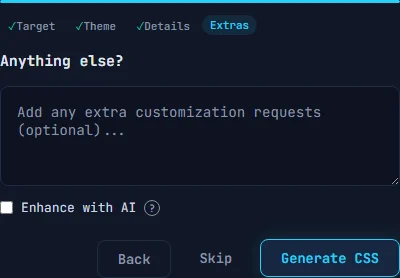
Add any extra customization requests as free text, and optionally check Enhance with AI to use one AI credit for more sophisticated CSS generation.
Live Preview
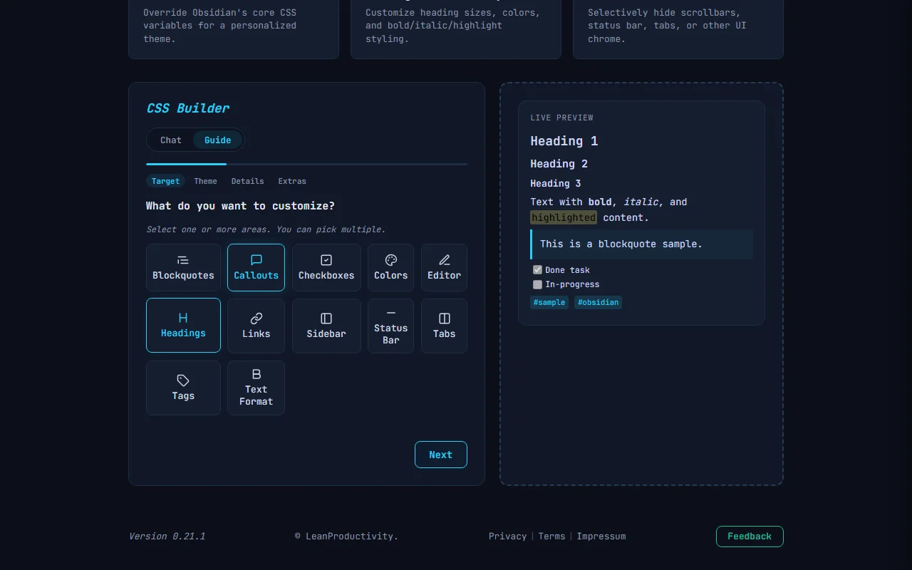
Pro and Power subscribers see a live preview panel next to the wizard. It updates in real time as you change settings in Steps 1-3. The preview renders sample content matching your selected targets - headings, callouts, checkboxes, tags, and more.
Use the theme toggle in the preview header to switch between dark and light mode preview.
Free tier
Explorer (free) users see a locked preview with a blurred sample. Upgrade to Pro or Power to unlock the live preview.
Result
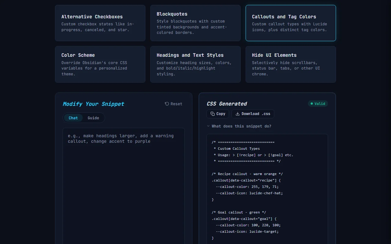
The output is a .css file for Obsidian’s .obsidian/snippets/ folder.
Each generation shows:
- A validation badge confirming the CSS is valid
CopyandDownloadbuttons
To install the snippet in your vault, see LOS - Installing Generated Files.
Related
- CSS - Syntax Highlighting - code block color customization
- CSS - Columns Layout - multi-column note layouts
- CSS - Embedded Callout - nested callout styling
- LOS - Bases Module - generate database views for your styled notes
- LOS - Templates Module - generate templates for notes in your vault